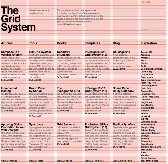
This weeks reading focused on web design basics.
HTML & CSS encompass content and style.
Content includes:
- Text, tables, lists, photos
- hypertext links
- spreadsheets, video clips, sound clips, and other applications
- markup: “paragraph”, “list”, “table”
Style includes:
- Colors, layouts, and fonts
The Separation of Structure from Presentation
This makes is easier to to maintain sites, share style sheets across pages, and tailor pages to different environments.
The Golden Ratio
- Used in the print industry & international paper sizes
- Originated within architecture & print design
Formula for golden section: a : b = b / (a + b)
What it means: a is to side b is to the sum of both sides. This concept has prevailed in western art and architecture for thousands of years.
Ex: Image
Post WWII Swiss designers built a design methodology around typographic grid =
A new & rational social order.
Names to know: Masimmo Vignelli, Joseph Muller Brockman.
Vignelli: born 1931. Italian. Modernist. Studied at Politecnico di Milano and later at the Università di Architettura, Venice. Started Unimark international in New York. Notable work with American Airlines. Signage for NYC Subway.
Brockman: 1914-1996. Swiss. designer and teacher. studied architecture, design and art history at both the University and Kunstgewerbeschule in Zurich. Had his own studio specializing in design, photography and exhibition design. Author of The Graphic Artist and his Design Problems, Grid Systems in Graphic Design where he advocates use of the grid for page structure, and the 1971 publications History of the Poster and A History of Visual Communication.
Heavily used Akzidenz-Grotesk (the inspiration for helvetica)
19th century books and magazines push the traditions of book designs with its boring one column to flexible multi columned pages.
This lead to the evolution of web design! Usability and design.
- Basic Structure of Design
- Organizes Content
- Divides infinite possibilities into smaller units
Units are the basic building blocks of a grid and are all uniform.
Groups of units create columns and the widths vary.
Example of choosing a font-size and line-height (leading)
body {
font-size: 12px; Decide on a base font. px: pixels. Convert to ems (?)
line-height: 1.5em; /* equal to 18px */ 1.5*base font-size. Tweak manually until it looks right. Apply line height to entire text.
Value to use for line height depends on font-size. line height = base line-height/font size
margin: 0; Adjust the margins, paragraphs, etc accordingly.
padding: 0;
}
*We can now set all those elements for which we want to be sized equal to our base font size
Contd. Ex:
p (paragraph), ul, blockquote, pre, td, th, {
margin: 0;
font-size: 1em;
line-height: 1.5em;
margin bottom: 1.5em;
*We want to change our level one headings to have a size of 1.67 times the base font size: 12 (current text size) x 1.67 = 20 pixels
The line height would have to be adjust: 18 (current line height) divided by 20 (new heading size) = 0.9 em (new line height)
The Code
h1 {
margin: 0;
font-size: 1.67em; /* equal to 20 px */
line-height: 0.9em; /* equal to ~11px */
margin-bottom: 0.9em;
Typography
Ex: < link href=’http://fonts.googleleapis.com/css?family=Cabin&vl’ rel=’stylesheet’ type=’text/css’>
If pasted in html; you can use the font in CSS font stack:
Ex: h1 { font-family: ‘Cabin’, arial, serif;}
The Constraints of Digital Design
1. Screen Resolution
Varying screens i.e. mobile devices, tablets
2. Visible Area of Screen:
- Different devices, operating systems & browsers affect ratio of visible area. Have to consider scroll bars, top/bottom bar & possible plugins
- Different grid for every resolution. A need for a logic & standardization that works for most. Ex: 1024×768 screen res = visible area is 974×650
Vertical Rhythm with Baseline Grid:
Most site are vertical
Baseline defines vertical rhythm. Text and images are read clearly when they match vertically.
When it doesn’t line up: less cohesive, disjointed.
Once You Learn The Rules, You Can Break Them!
…And Still Maintain Structure.


